Echoview 16 is coming soon! We’re sharing some sneak peeks of innovative new features designed to elevate your hydroacoustic analyses, enhance data visualization, and make your workflows even more efficient.
A highlight of the upcoming release is the introduction of bubble plots—sometimes known as bubble charts or proportional symbol maps. These let you spatially map key metrics, providing a more dynamic and intuitive refresh of our traditional alongtrack displays.
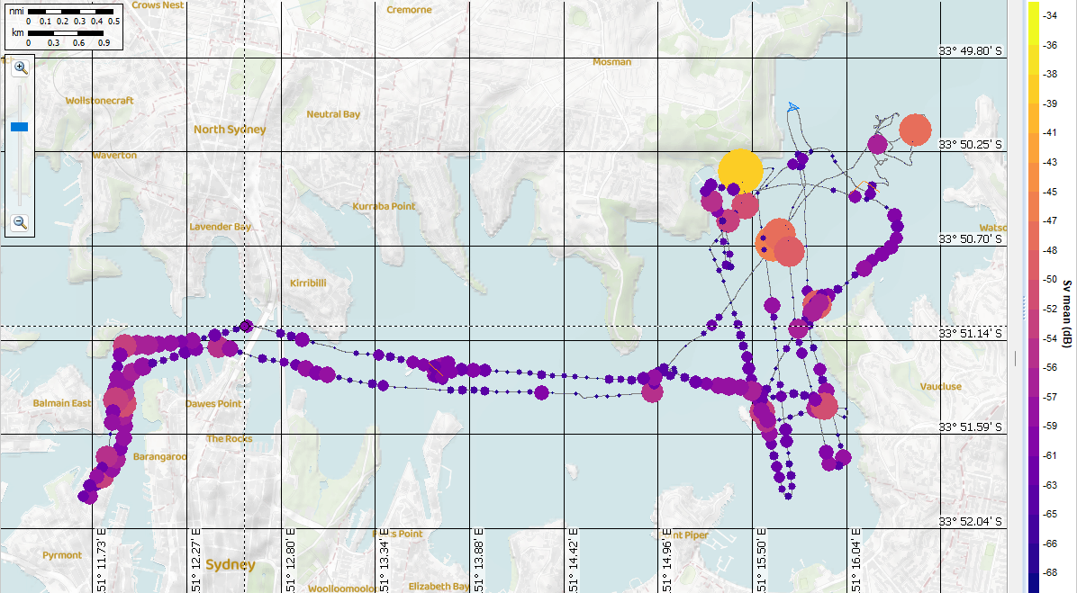
In the image above, bubbles are colored and sized based on water column Sv mean in 100 m intervals. This not only provides a clear spatial overview but also highlights outliers—like the large yellow bubble here, which reveals bottom signal mistakenly included in the water column data.
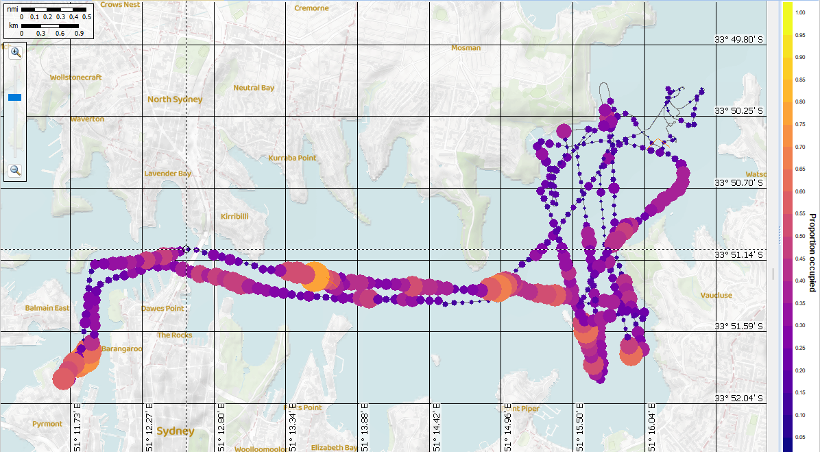
This second image shows the same data with bubbles representing the proportion of the water column occupied by above-threshold data—one of the “echometrics” group of analysis variables suggested by Urmy et al. (2012) to assess distributional variability.
Bubble plots in Echoview will allow you to explore data trends and outliers before running full analysis exports, and they make it easy to generate presentation-ready visuals.
Echoview 16 will be available for beta testing in the coming weeks, and will be officially released later in 2025.
Did you see our previous sneak peek?
To be notified when new releases are available, please join our mailing list.